J.AR OFFICE
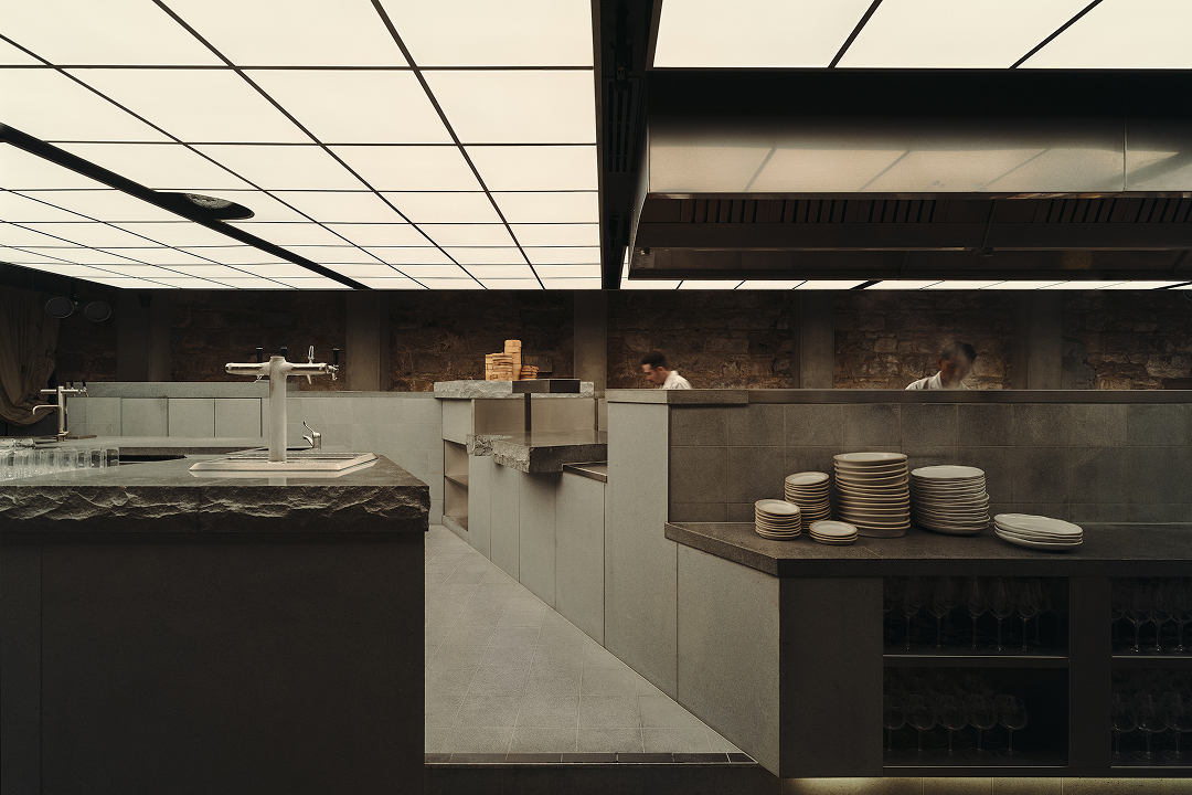
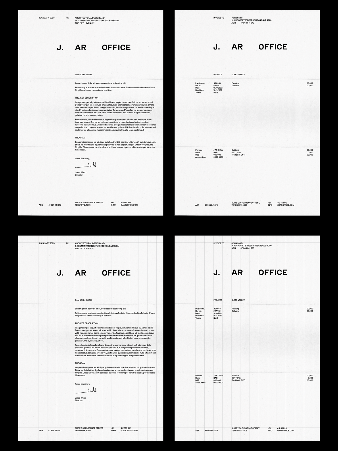
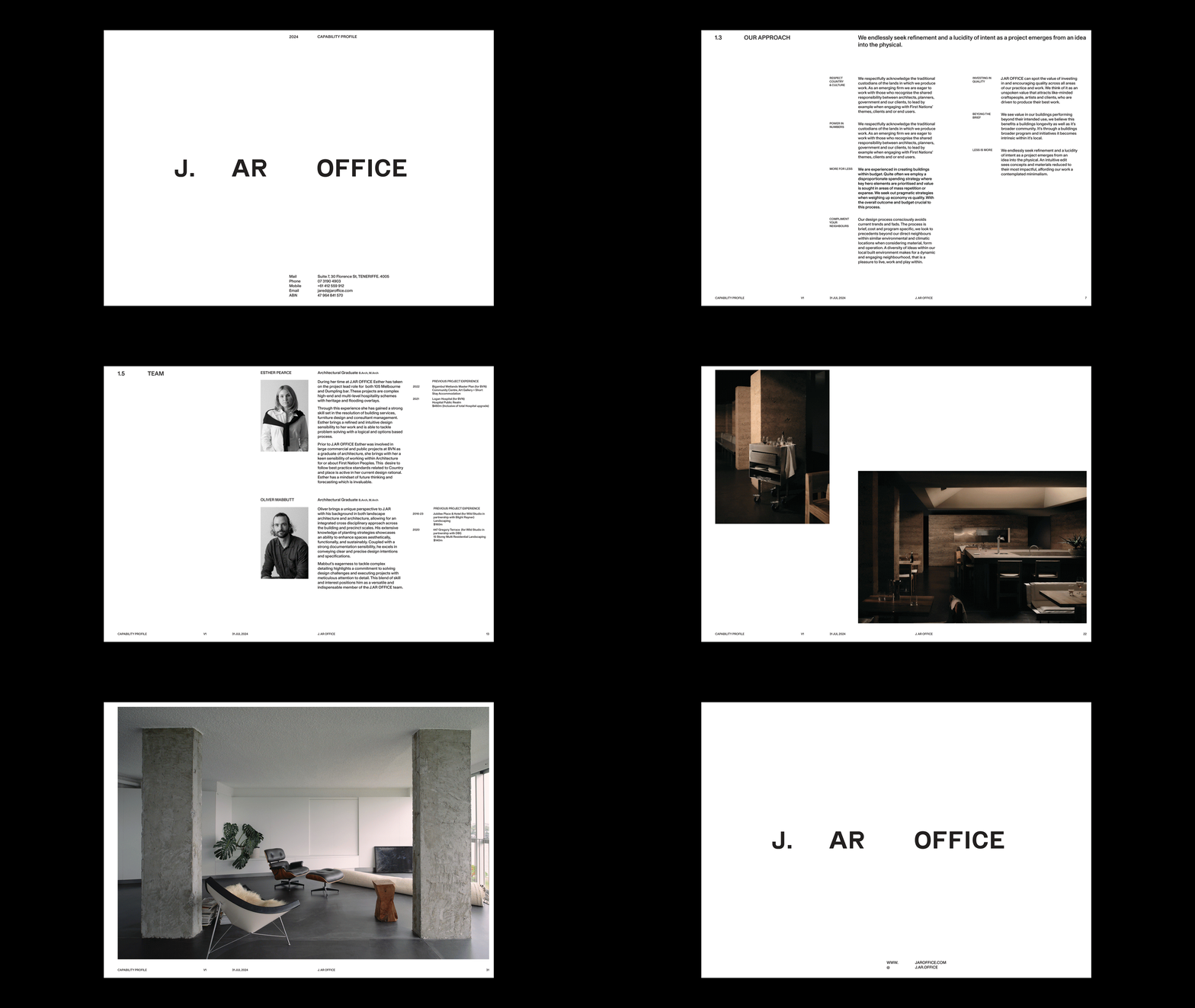
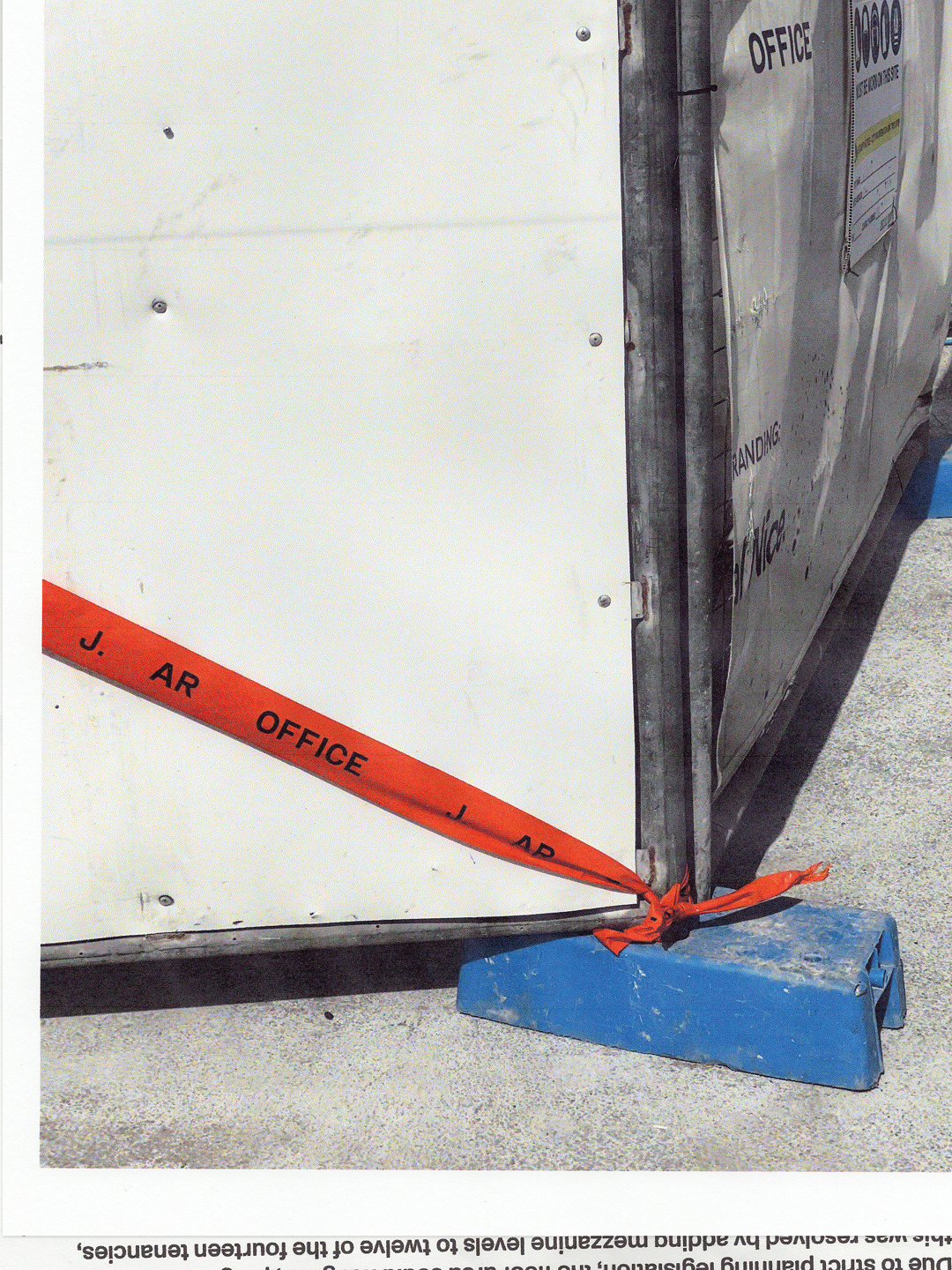
We partnered with emerging architecture practice J. AR OFFICE to create a brand identity that establishes them as a commercial force in the Australian architectural landscape. Reflecting the firm’s reductive and austere approach to architecture, our solution centred around clarity, utility, and the rejection of superfluous detail.
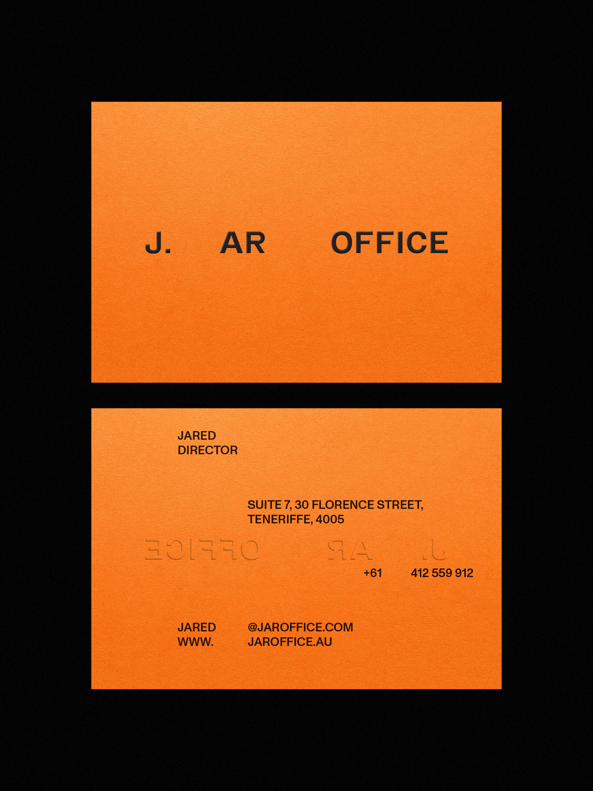
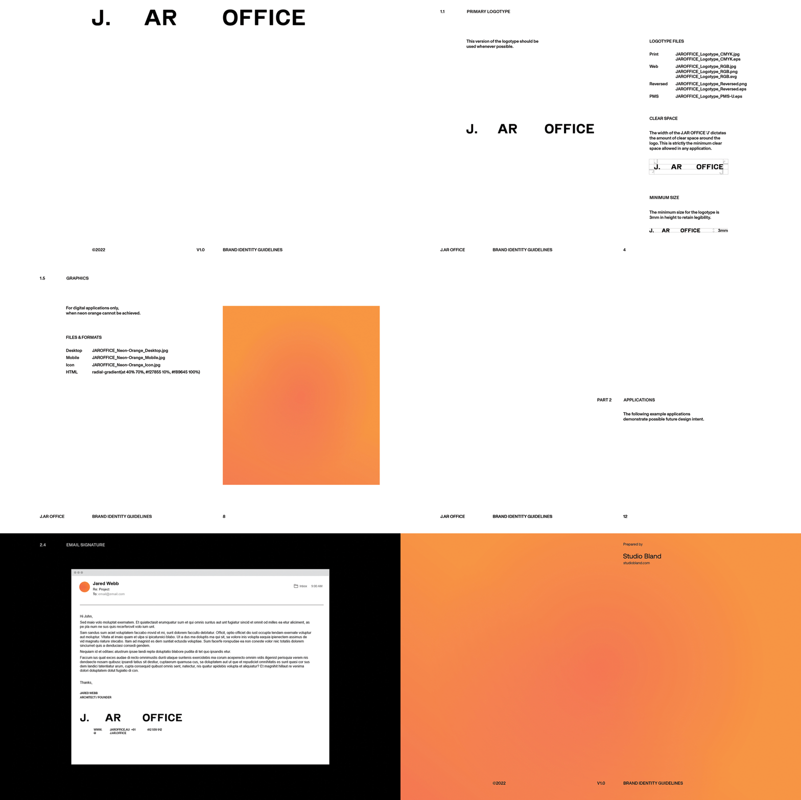
The J. AR OFFICE logotype draws inspiration from the technical sensibilities of contemporary typefaces while preserving the distinctive character and quirks of early grotesques. Its robust letterforms exude quiet confidence, mirroring the architectural practice’s ethos. This interplay between technicality and subtle character forms the backbone of the brand’s visual language.
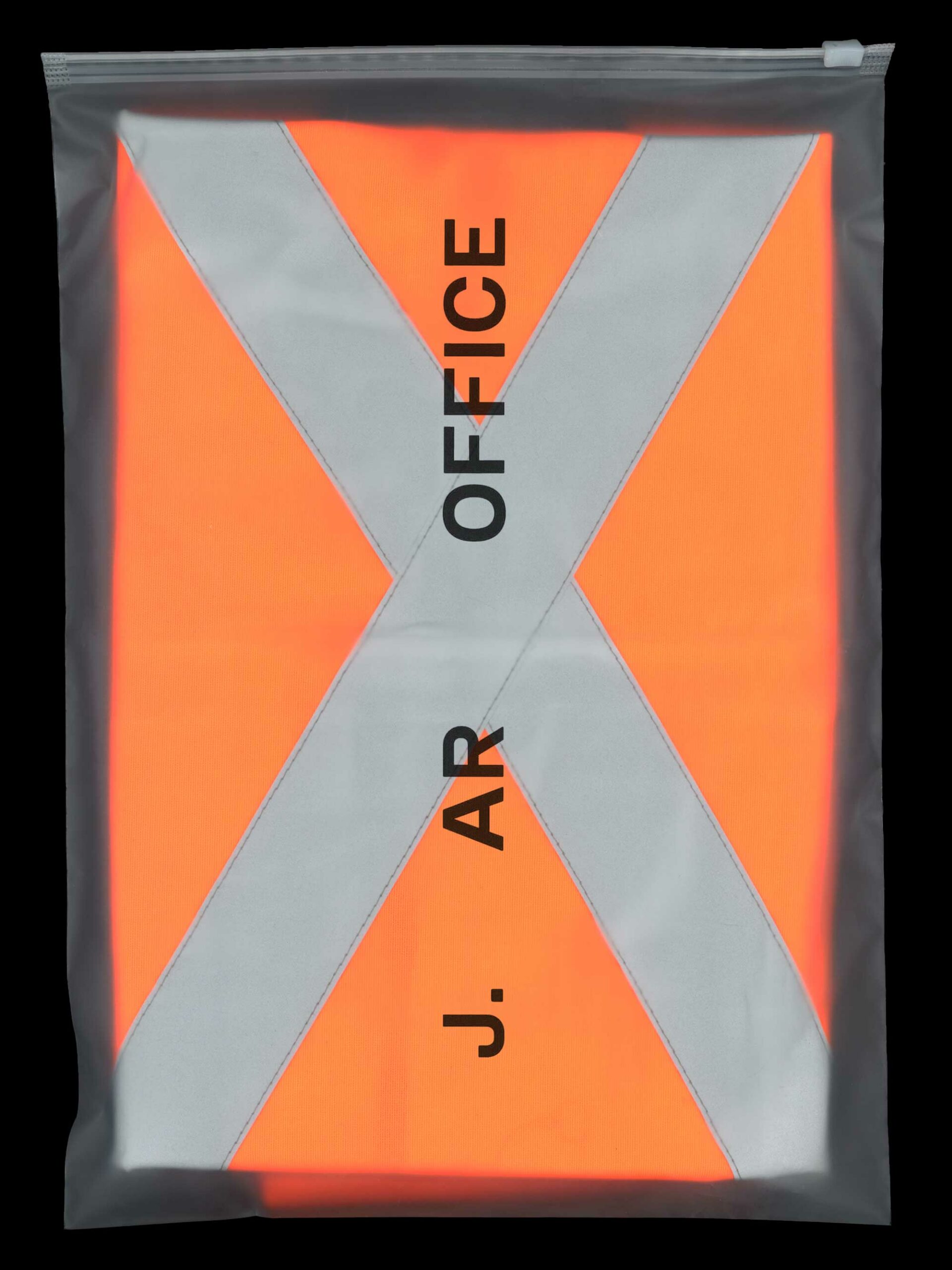
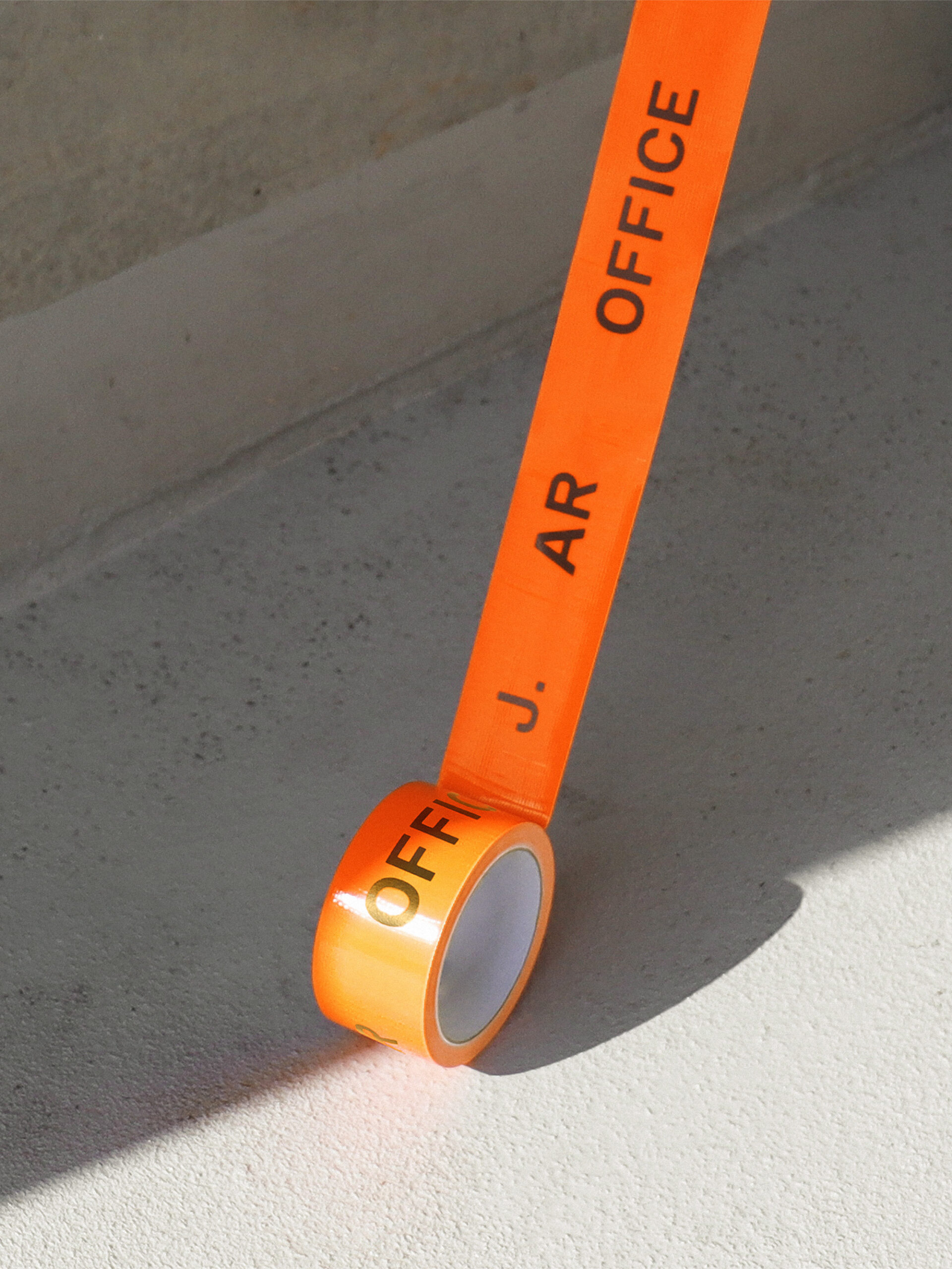
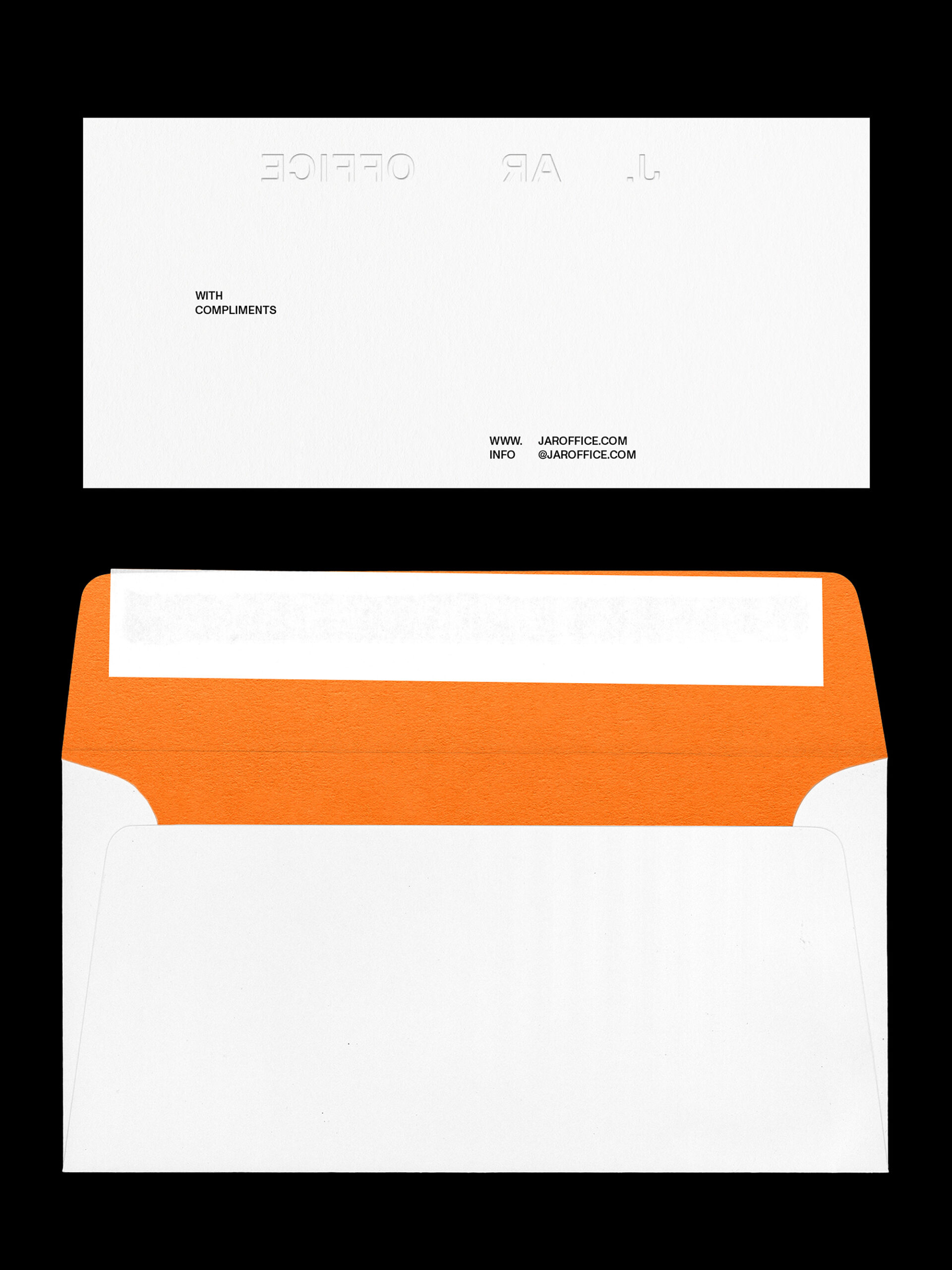
Minimalism defines J. AR OFFICE’s identity, with a distinct absence of colour and ornamental flourishes apart from the use of a neon orange accent colour across touchpoints. This potent use of a single bold colour injects a measured playfulness into the brand, contrasting with the utilitarian typographic system. The outcome communicates J. AR OFFICE’s distinct visual style, quickly differentiating the firm from its competitors.
Project Scope
- Brand Identity
- Art Direction
- Website
- Print Collateral
- Digital Collateral
- Merchandise

Credits
- Live Site J.AR Office
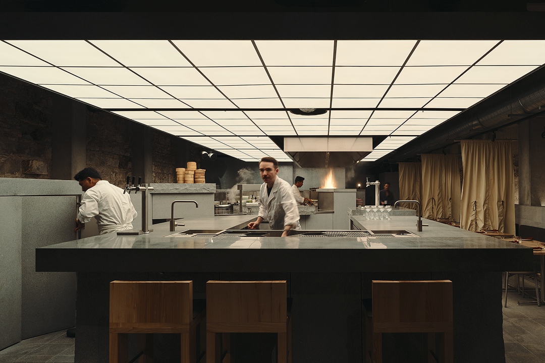
- Interior and Architectural Photography David Chatfield
- Print Hungry Workshop
- Typeface Monument Grotesk by Dinamo
