Marco Polo
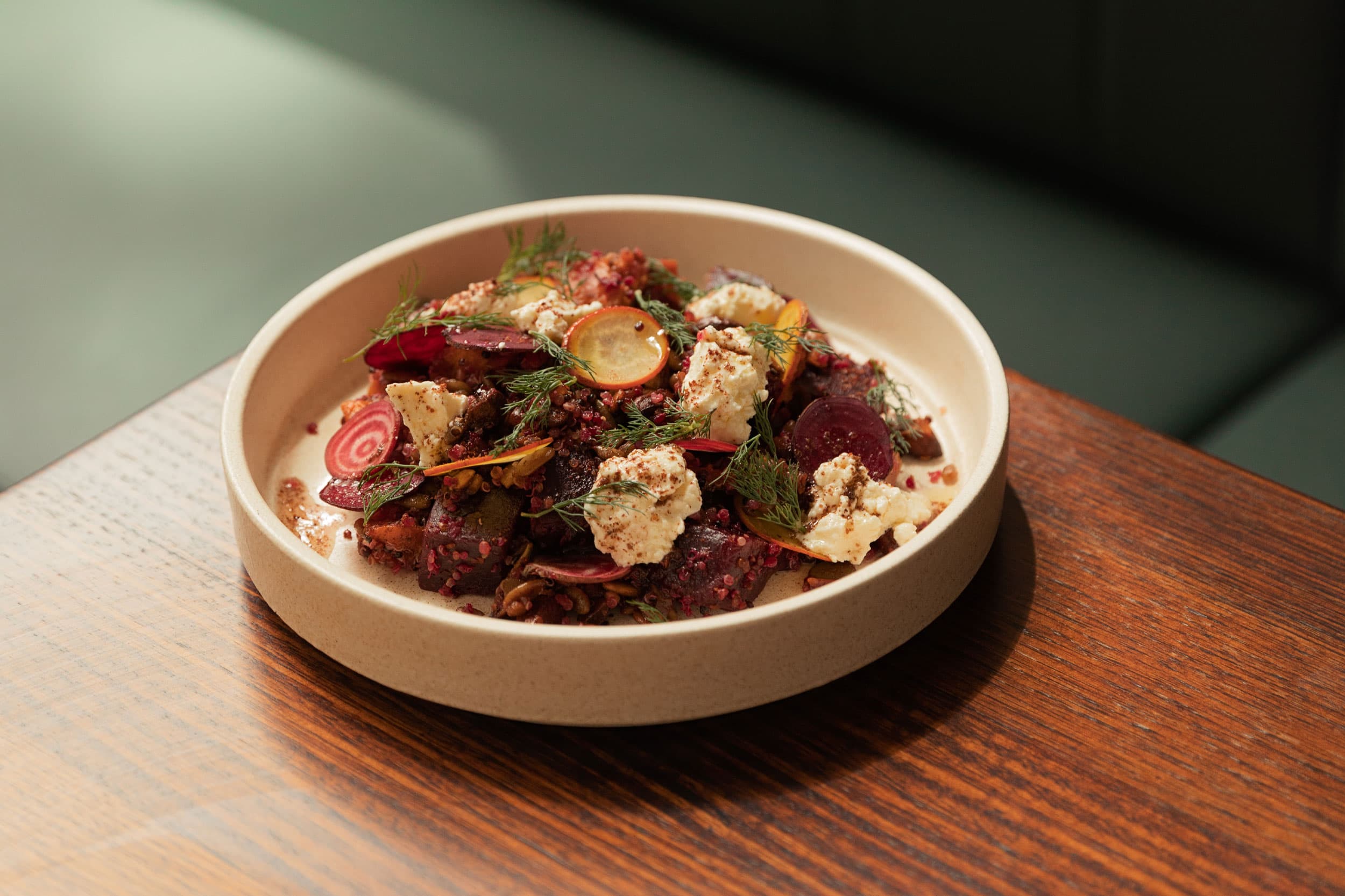
Located within the No. 1 Anzac Square building in the heart of Brisbane city, Marco Polo kitchen serves great coffee and delicious eats to its bustling city community.
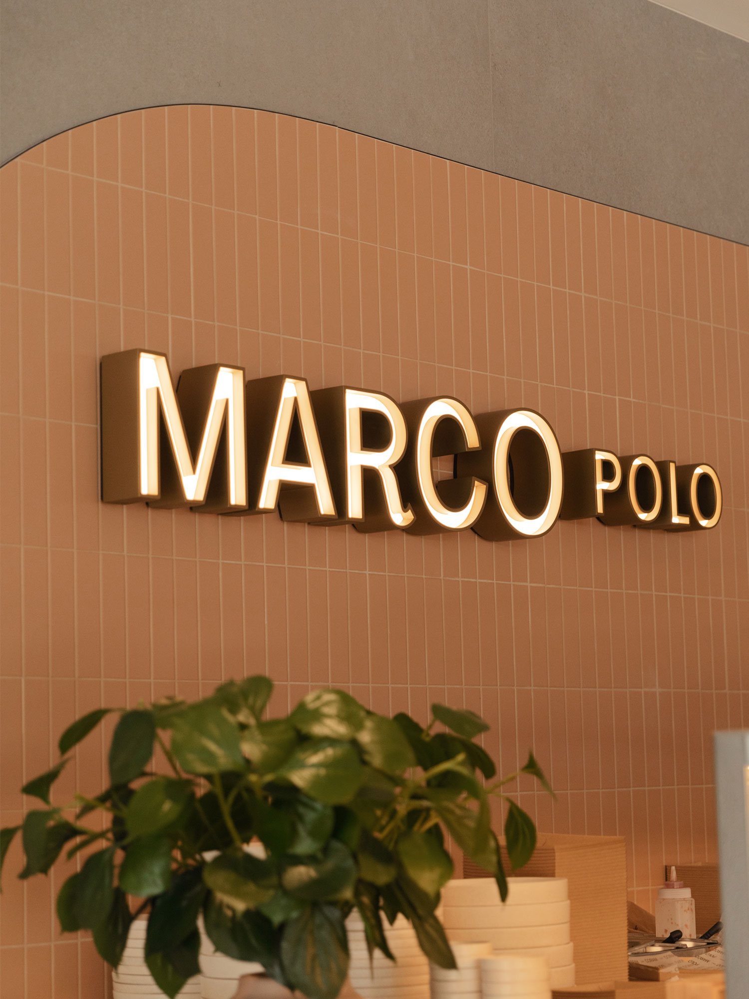
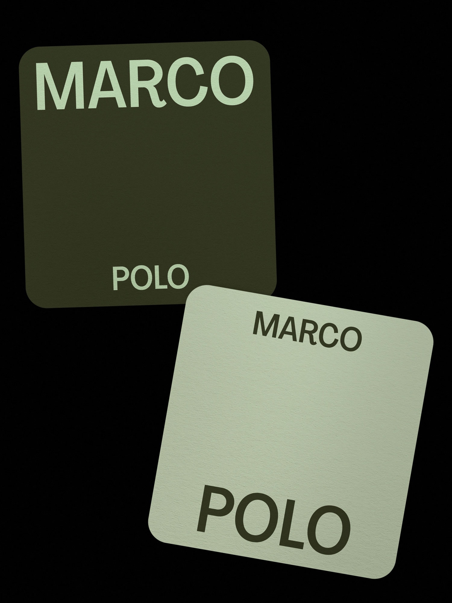
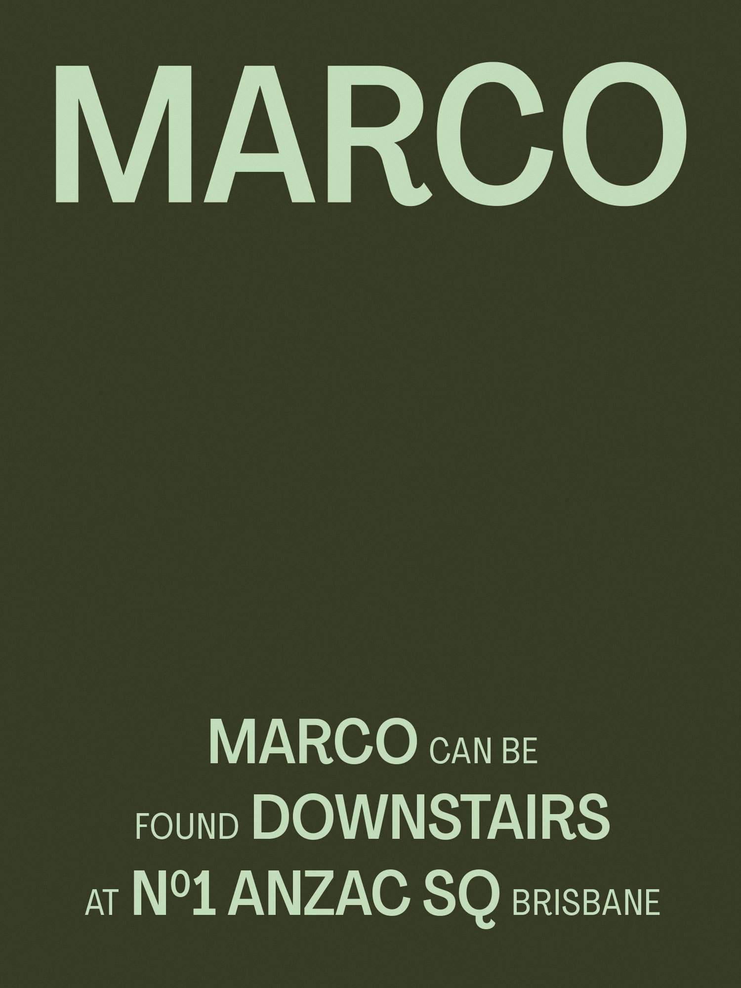
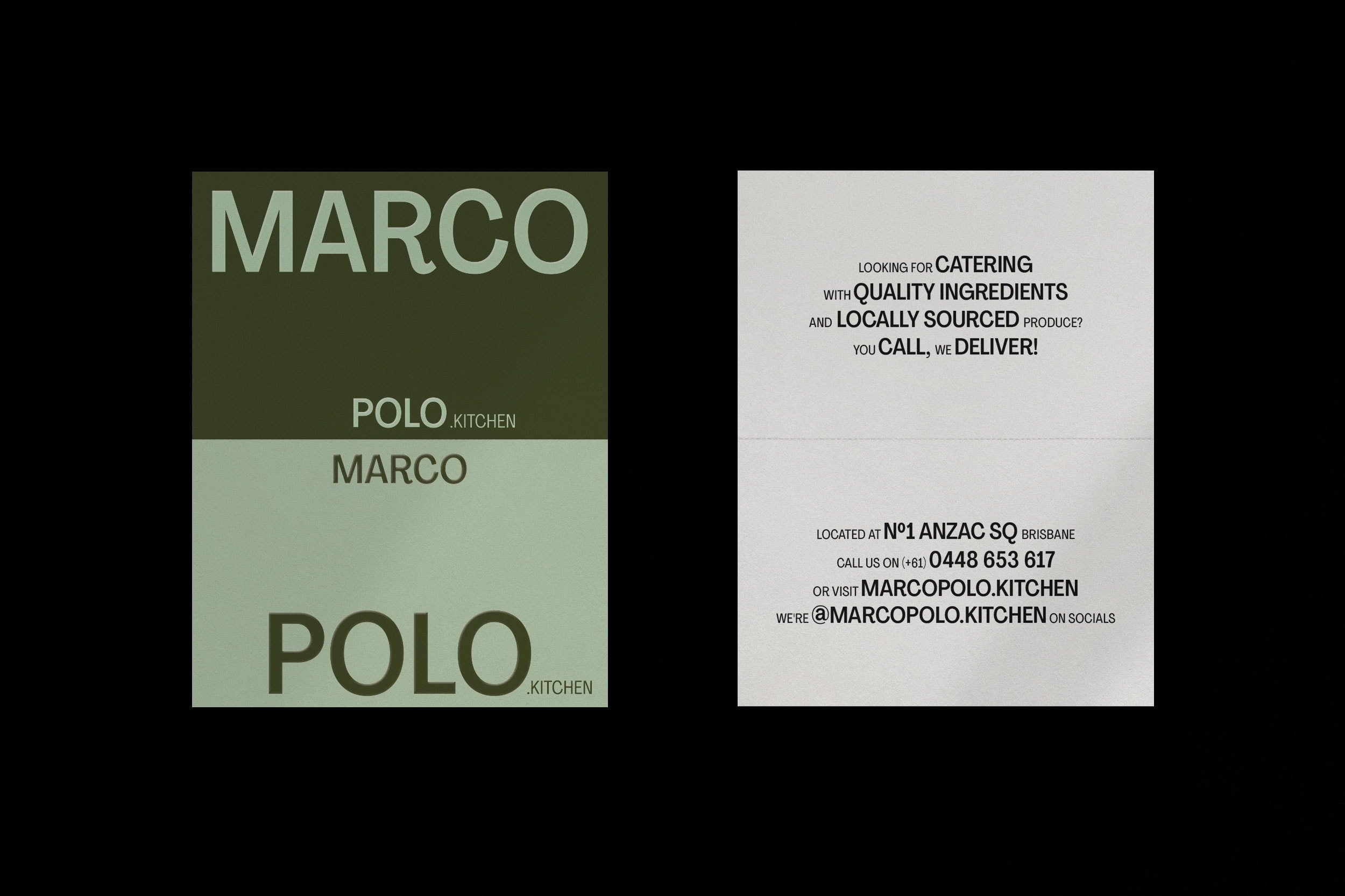
Split into two venues – Marco downstairs and the more intimate Polo upstairs, our brand identity plays upon this split and the call and response of the classic childhood game of the same name.
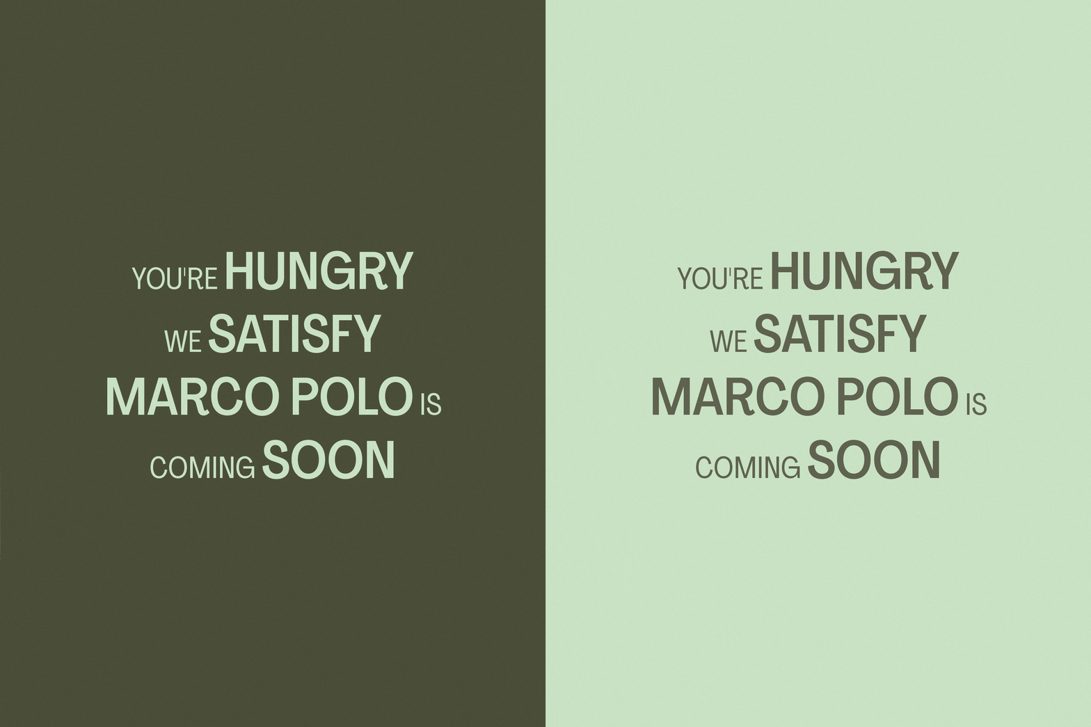
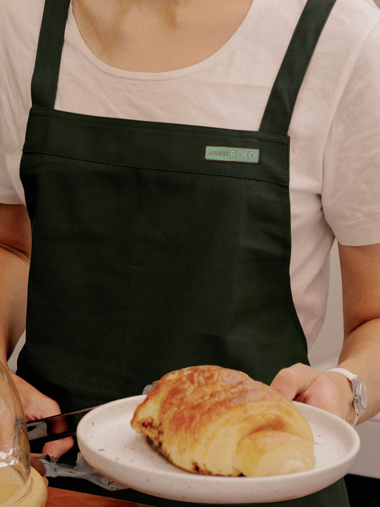
The identity balances boldness and playfulness within its refined and corporate surroundings. Bold typography, iconography and photography is coupled with a pared back tonal colour palette.
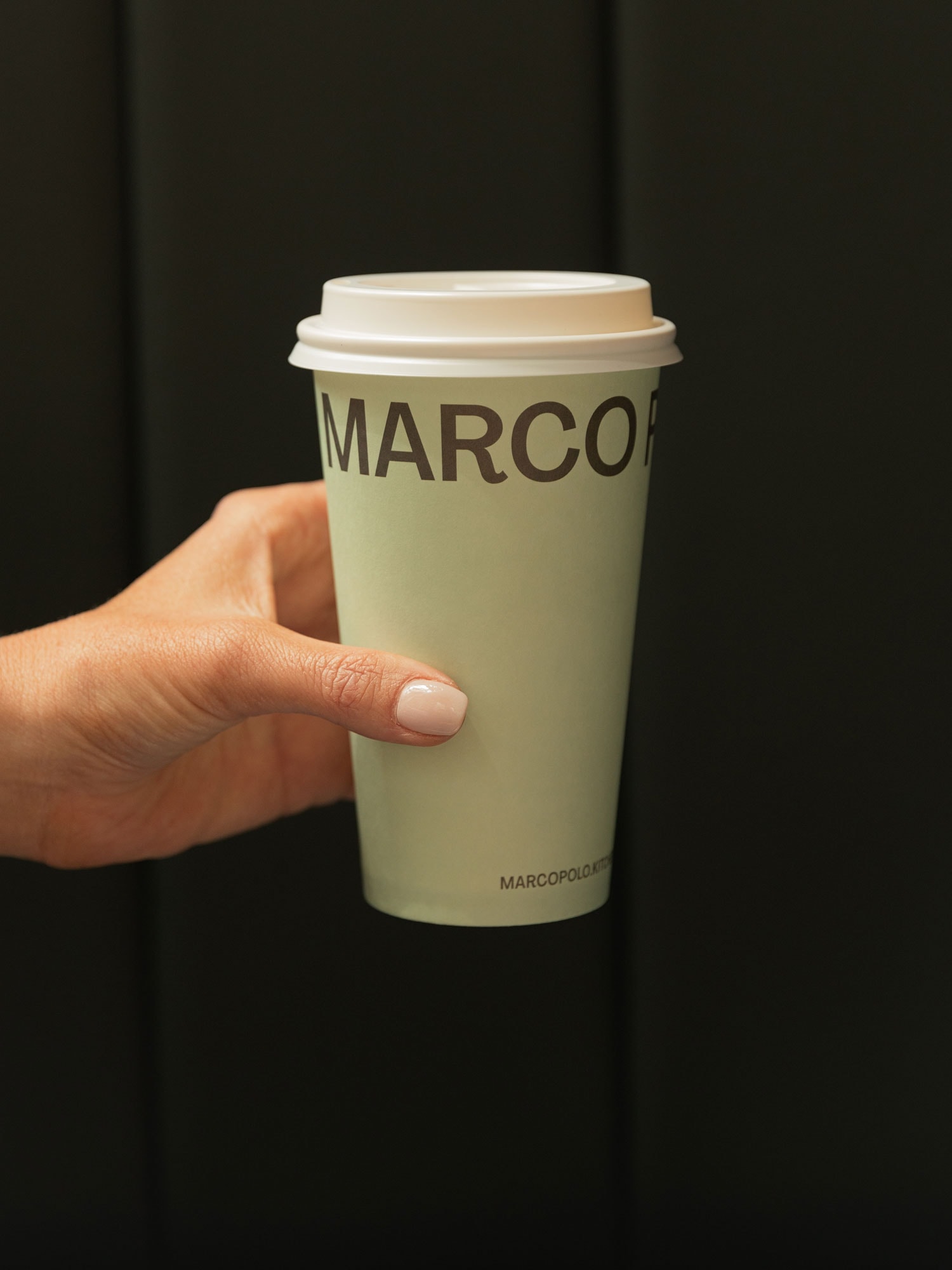
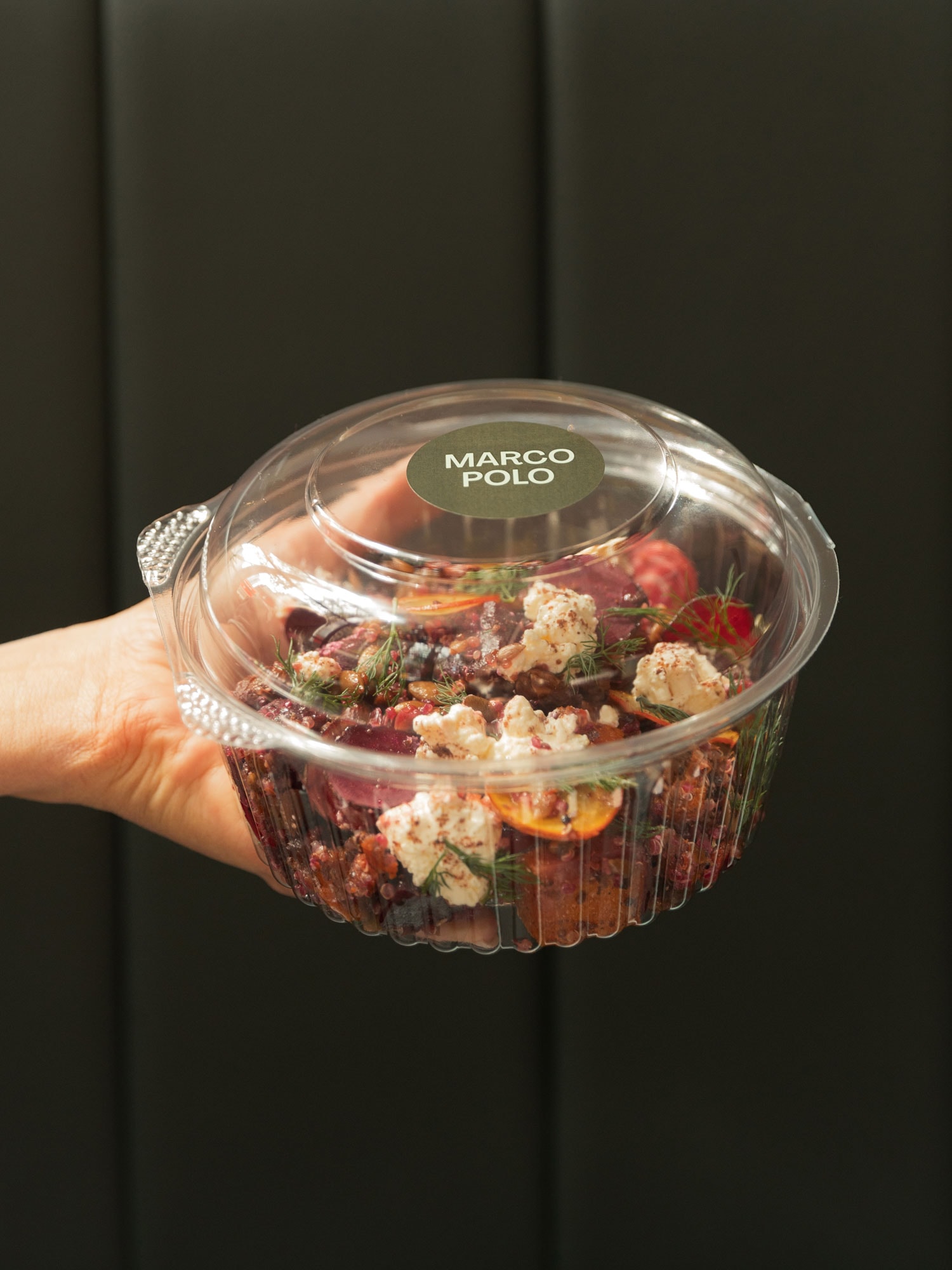
The bold typographic treatment extends to operational collateral such as takeaway coffee cups, printed menus with a tactile green foil embellishment, and clever application of branded tape to otherwise standard containers.
The brand aims to inject some personality and playfulness into its customer’s days whilst sitting harmoniously within the refined surroundings of No. 1 Anzac Square.
Project Scope
- Brand Identity
- Print Collateral
- Operational Collateral
- Packaging
- Website design
- Signage
Credits
- Photography Grace Elizabeth
